“Our” vision, “their” vision or no vision?

Covering conflict is one of the consistent features of photojournalism throughout its history. From Roger Fenton in the Crimea and Mathew Brady and company in the Civil War up through the photographers who are covering Iraq, Syria, Afghanistan, we have seen images that convey fighting and aftermath.

Political shifts in the last decade or so have changed some aspects of conflict. Wars are to some degree between sovereign nations, but wars are also being fought between groups of people with a particular view, or between nations and those groups. It seems rules of covering war have changed too. It’s always been a risky proposition, but there has been some respect for those who are there to tell the story. That, in turn, is changing the vision we have of conflicts.

A couple of blog postings this week more sharply focused what had been some fuzzy thoughts for me. Donald Winslow’s thoughts on the legacy of Eddie Adams are featured on the New York Times Lens blog. Michéle Léridon has some thoughts on the AFP Correspondent blog about covering the “Islamic State.”

Both authors note that photojournalists are not the only ones supplying photographs and increasingly are not there to make photographs. The risks to photographers are too great to send them into conflict zones where they have no protection. Some freelance photojournalists are trying to fill the void and paying with their lives. So we don’t have the photographs that would reflect the “disinterested” view of the photojournalist. I put that in quotes because, yes, the photographer is representing the western view (“our” vision) but is not there as a representative of the government. (Debates about the neutrality of embedded photographers aside.)

In that void come photographs provided by the groups with a stake in the conflict, such as the current group hoping to set up an Islamic state in the Syria/Iraq area. They are producing and distributing their own photographs and videos (“their” vision). As Winslow notes, “As they attempt to control the message, honest and ethical journalism risks being shoved aside in favor of images that are pure propaganda, if not outright fabrications.” Léridon also notes AFP’s goal of not being used as a vehicle for propaganda.

So if we don’t trust their vision and can’t get our vision, is the alternative no vision? Do news organizations refuse to give space to images they can’t obtain through their own channels? Is publishing their images giving them what they want? If no one knows about a conflict, will it fizzle?

It’s a hard question, and one that’s not new. Photographers, editors and publishers have struggled with the aspects of conflict that should be presented to the public, and the decisions have varied depending on the nature of the conflict and the role the organization sees for itself within the larger society. I don’t think the answers are any easier now. I don’t want to see photojournalists injured or killed for trying to bear witness for the rest of us, but I don’t want just the images that people with a vested interest distribute, the content of which can’t be verified for accuracy. And I don’t think just ignoring it while the combatants do their thing is the answer either.

I don’t have the answer, but I’m glad people are asking the questions. Take a look at the pieces by Winslow and Léridon.
Babies as photo collectors?

I saw this item on the PDN Pulse blog this morning. A Pittsburgh photographer has received a $10,000 grant to send newborns home with signed prints from local photographers.

The idea was a response to sending babies (and their parents) home with Pittsburgh Steelers “Terrible Towels.” The photographer thought sending them home with art might have a deeper, longer-lasting impact.

I don’t know whether it will turn babies into collectors. My own experience is that you can provide something for the kid but can’t guarantee that the appreciation (if any) will stick that long. In the long run it may mean more to the parents than to the kid.

However, it’s a creative way to use photography, and it’s great that people with funds apparently are looking for unique visions.

A good photo doesn’t just show you what happened — it shows you why it matters.

That’s a quote from an online article called “Why photojournalism is still a real job.” The article, on the website CULT#MTL, is a review of the exhibit of World Press Photo winning images currently on display in Montreal. In it, author Lisa Sproull notes that “everyone’s a photographer these days.”

But being a photographer doesn’t make one a photojournalist. Photojournalism is communicating. It’s using visual messages to do more that show something that happened. Photojournalists also convey impact and meaning. As Sproull notes, “A good photo doesn’t just show you what happened — it shows you why it matters.”

Showing people why things matter is a skill, and it’s why photojournalism matters.

New tool for some old data – with a twist

I didn’t think there was much more that could be done with the database of Farm Security Administration/Office of War Information photographs in the Library of Congress. Then I was made aware of the Photogrammar project from Yale University.

The project is a new way of looking at the work in the FSA/OWI archive. The Library of Congress has had a searchable database of these images, along with many digitized versions of the photographs. Searching for a photographer or a topic or even a location would return a list of photographs matching those terms. So I didn’t think the Photogrammar project was going to be much more than a different way of accessing the same database.

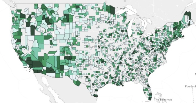
In some respects, that’s true. The main apparent difference is that instead of a search box, visitors to the Photogrammar site are presented with a map of the US. Different shades of green indicate the frequency with which a location is represented in the photographs of the FSA/OWI archive.

photogrammar-fsa-screenshot

There are a couple of neat things about this. First, the visual presentation means that if I can’t think of the name of a specific location or don’t have the right spelling, I can still find it on the map. I can also easily see nearby areas where photographers might have worked. Second, it’s an immediate look at the breadth of where the FSA/OWI photographers worked during the project. There heavily-covered areas are immediately apparent, as are the ones that got little attention. I like this map for what it says about the sociology of the project.

There’s another aspect of this project that definitely adds to the information available. According to one of the blog posts on the project site the call numbers associated with the individual photographs in the Library of Congress archive had a letter/number combination at the end. A little digging indicated that the numbers presented a sequence, as in the order of frames on a strip of negatives. This led the researchers to investigate further, eventually determining that using the codes could allow them to reconstruct the order in which the photographs were made. So now instead of seeing a list of photographs that a photographer made in a specific location we have the opportunity to investigate the order in which the photographs were made and what that tells us about the photographer’s approach.

That’s kind of cool, and it adds to the potential for teaching and research of the LOC archive of these images. Thanks to the people at Yale for taking on this project. Check it out by clicking on the link or the map above.